mobile app | design lead

CivicTech app to promote youth engagement.

CivicTech app to promote youth engagement.

CivicTech app to promote youth engagement.

ROLE

Lead Product Designer

tools

Figma, Notion, Loom, ClickUp

duration

3 weeks

  • Thoughtful onboarding

    We learned from research that an onboarding that explained the app clearly was key for success.

    Weather app image
  • Personalized experience

    Users would only engage with causes they cared about, so we ensured they'd only see those.

    Weather app image
  • Gamified experience

    Users can scroll through the different actions available, seeing the rewards they can get.

    Weather app image
  • Tutorial experience

    Research showed it was imperative for users to understand the app from the get-go to avoid drop-offs.

    Weather app image
  • Clear expectations

    Scannable intro screens to provide quick information that helped users make decision to move forward.

    Weather app image
  • Game levels

    Research showed leveling up was a big incentive for users, and something they share with peers.

    Weather app image
  • Visual wallet

    The data visualization offered an incentive for users to want to see the balance continue to go up.

    Weather app image
  • Gamified profile

    The user profile, as in a game, focuses on the user's levels, their expertise and how they can level up.

    Weather app image

Project description

Project description

Project description

CommonAlly sought to engage youth in civic action, as well as inform political arms of youth stances through a marketplace where youth could own and broker their data in exchange for monetary incentives.

CommonAlly sought to engage youth in civic action, as well as inform political arms of youth stances through a platform that allowed them to earn money by sharing their opinions, and also sell their data profile on the app marketplace.

Problem

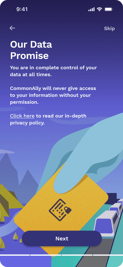
Selling your own data was a new concept for users. CommonAlly needed to achieve trust and understanding in their marketplace for it to work.

They needed to validate that users would trust institutions with this data, and understand how to achieve continuous engagement.

Response

Various iterations leading to an MVP that provided users with information and controls on how their data could be accessed, and a gamified experience to promote engagement.

Process

Process

Process

Understand

Research to deepen understanding of user needs. Map the systems, players & workflows, and align with stakeholders about problem definition.

Conceptualize

Early explorations that get shared quickly to establish direction: sketches, user flows, and information architecture. These evolve into higher fidelity workflows.

Evaluate

Share & measure - repeatedly. Through usability tests, and ensuring measurement plans are in place once the feature ships. Also, ensuring all stakeholders are trained on it.

Research

Research

Research

We interviewed 10 candidates that fit the target audience CommonAlly was focused on understanding their sentiments on data privacy and brokering their data, as well as the kinds of digital experiences that kept them coming back for more.

Behaviors

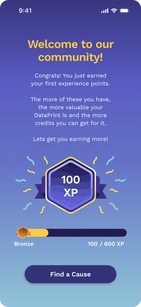
-> Motivated by point systems

-> Feel accomplished when the impact of their actions can be measured

-> Consume short + highly visual content

Pain points

-> Concerned about what aspect of their data is being collected and by whom

-> Want to know how their data is being user after they sell it.

-> Want control of who gets their data.

Information Architecture

Information Architecture

Information Architecture

I had to balance between users wanting to know about data usage and privacy, and also not wanting too much text, and having a visually engaging, bite-sized experience.

I implemented a tiered approach, where the higher level was short, stylized, just the necessary information, followed by further detail once some engagement was initiated, and optional opportunities to drill in for those that were most curious.

Onboarding experience

Onboarding experience

Onboarding experience

The usability tests I did with our researcher taught me how high-risk our onboarding experience was for drop-offs. This was a key moment in the journey to earn the user's trust enough to keep going. What ended up testing best was to include:

  1. Clear transparency on how their data would be used.

  2. A little welcome incentive that made them want to get more.

  3. Personalization to made users know that they only had to engage with the content they chose.

The usability tests I did with our researcher taught me how high-risk our onboarding experience was for drop-offs. This was a key moment in the journey to earn the user's trust enough to keep going. What ended up testing best was to include:

  1. Clear transparency on how their data would be used.

Onboarding experience

  1. Personalization to made users know that they only had to engage with the content they chose.

  1. A little welcome incentive that made them want to get more.

Weather app image
Weather app image
Weather app image
Weather app image
Weather app image
Weather app image
Weather app image
Weather app image
Weather app image
Weather app image
Weather app image

Homepage + Action Cards

Homepage + Action Cards

Homepage + Action Cards

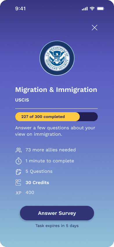
I knew we needed to make the content digestible, familiar, clickable and easy to interact with. We implemented the following:

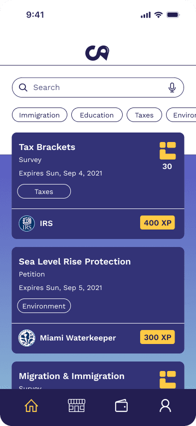
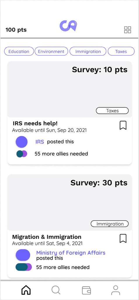
  1. Opted for a feed experience, which tested well with users.

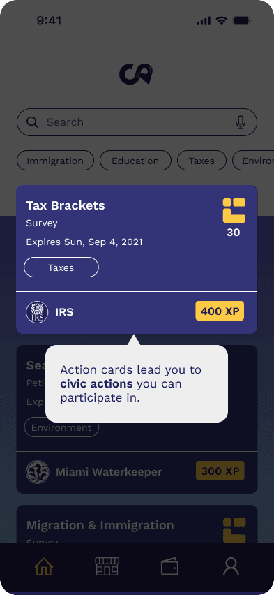
  2. Simplified the information architecture of the action cards after receiving confused feedback from users.

  3. Implemented an introduction screen that summarizes key properties about the impact action before user begins.

Weather app image
Weather app image
Weather app image
Weather app image
Weather app image
Weather app image
Weather app image
Weather app image
Weather app image

Wallet

Wallet

Wallet

We knew that:

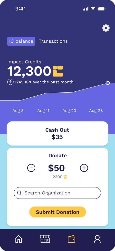
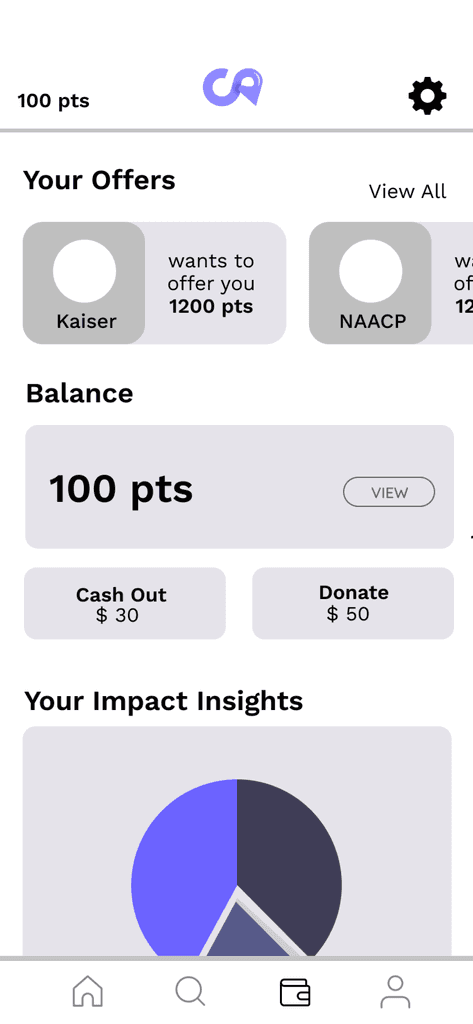
  1. Users needed to cash out their impact credits.

  2. Users needed to be able to see offers on their DataPrint (their data profile available for sale on the data marketplace).

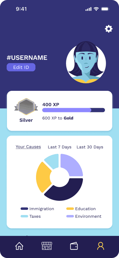
  3. Users needed to be able to track how many XPs

  4. Users wanted to see where their impact was going.

I initially designed for all of these to be held within the wallet, but quickly learned through testing that it was too much, and users didn't understand it.

I realized each needed its own space, and the wallet needed to be only for impact credit transactions.

Weather app image
Weather app image
Weather app image
Weather app image

Data marketplace

Data marketplace

Data marketplace

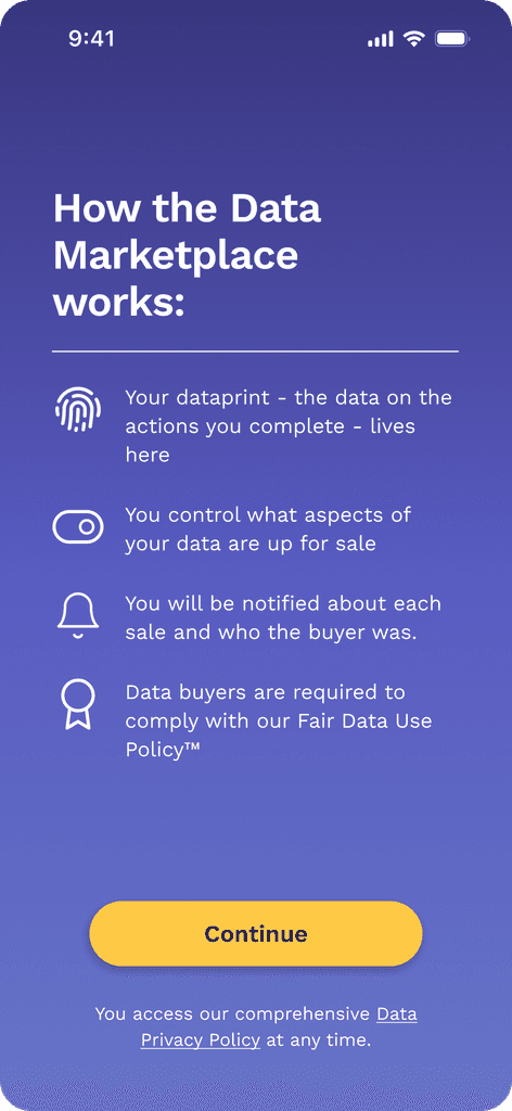
During our engagement, the data marketplace changed from user-managed offers to sales happening in the background.

Users reacted negatively to this change. I eased some of that reaction by including an intro screen to the data marketplace that spoke more of our privacy policy worked, and by giving them full control through a toggle UI, of which aspects of their data they wished to make available.

We also agreed to include in the roadmap a way to blacklist certain organizations from buying their data.

Weather app image
Weather app image
Weather app image
Weather app image
Weather app image
Weather app image
Weather app image

User Profile

User Profile

User Profile

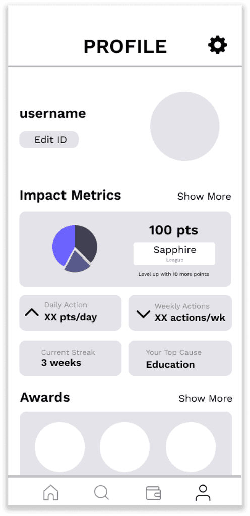
While early iterations of the user profile tested very well. Things like the Trends feature were taken out of scope for the MVP iteration to simplify things for the engineering team.

This resulted in more focus on another loved feature, which is seeing where the user's impact is going.

Awards also got deprioritized as the whole award system needed to be created.

Weather app image
Weather app image
Weather app image
Weather app image

Results

Results

Results

We did a final round of usability tests + research before concretizing what would be part of the MVP.

Homepage

-> Users had a better understanding of the cards. "I instantly know what's going on here. There is no useless information", was one example feedback.

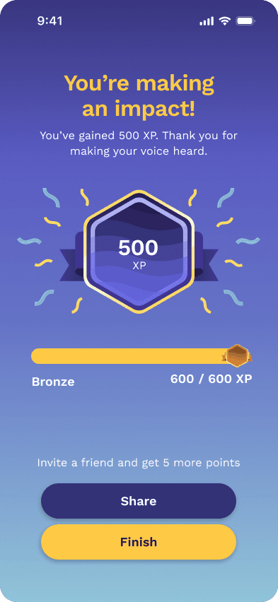
XPs & Impact Credits

-> When we made points into XPs, users immediately made the connection to how they worked in video games and understood the difference between XP and impact credits.

Tracking of data

-> Users continued to ask to be able to know how their data is used post-sale. This has a very hard feasibility, for which we found a good compromise to be adding black-listing organizations to the product roadmap.