Web app | Design lead | Fintech
Task management system for B2B marketplace internal tool
ROLE
Lead Product Designer
tools
Figma, Loom, Notion, Jira
Duration
2 months
Innovation Refunds’ main mission was democratizing the Federal Grant and Incentive space that has been traditionally dominated by large enterprise companies and provide access to the average SMB.
This process was extensive and supported by the internal team of Processing Specialists (PS) assigned to each customer to help them take their case to the finish line - part quality control, part sales team.
Problem
No standardized process was in place for how Processing Specialists should prioritize cases, and to know when a case needed their attention post initial review they needed to go back in and check manually, consuming a lot of their time.
Response
A 2-part task management system designed for their portal in which they see notifications for when cases need their attention throughout the case lifecycle, prioritizing the cases that should be tended to first. Then within the case themselves clear indication of where to go and what to do to move it forward in the most efficient manner.

Understand
Research to deepen understanding of user needs. Map the systems, players & workflows, and align with stakeholders about problem definition.

Conceptualize
Early explorations that get shared quickly to establish direction: sketches, user flows, and information architecture. These evolve into higher fidelity workflows.

Evaluate
Share & measure - repeatedly. Through usability tests, and ensuring measurement plans are in place once the feature ships. Also, ensuring all stakeholders are trained on it.
I drove discovery sessions with the processing specialists to understand the pain points of what we had missed. We found:
They had no clear way of prioritizing between cases.
Didn't have a way of knowing if a case needed their attention after the initial review, had to check manually.
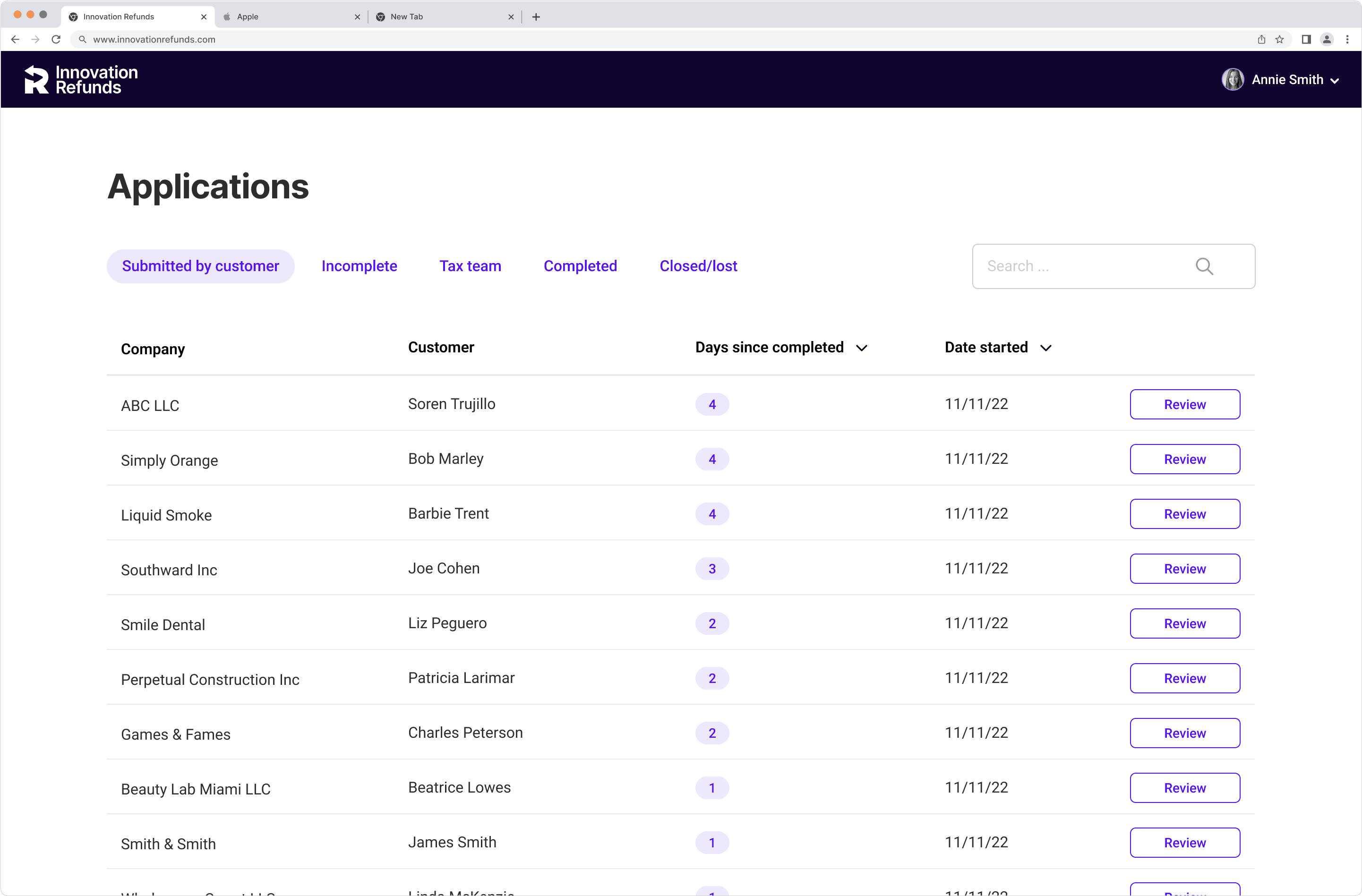
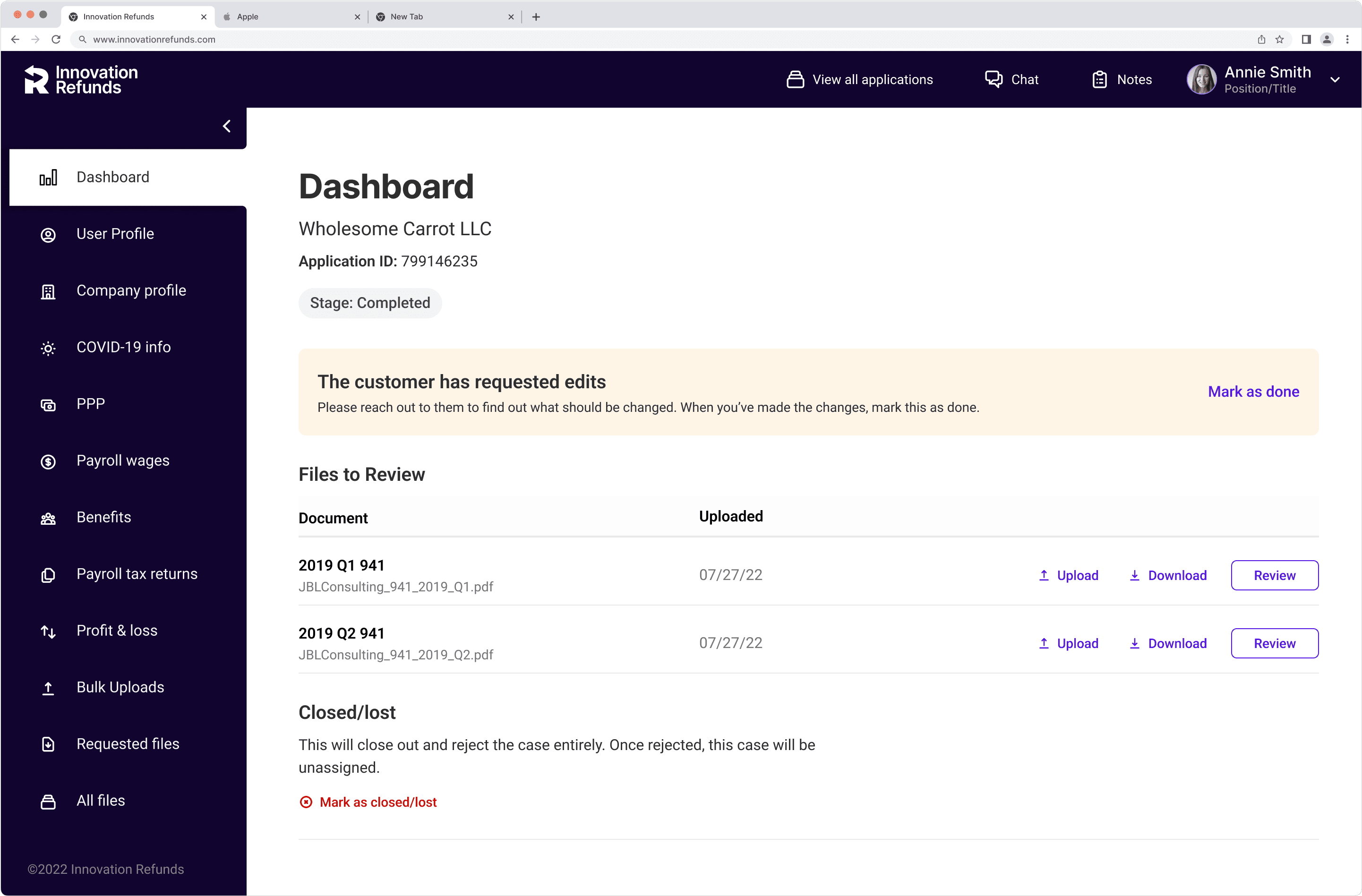
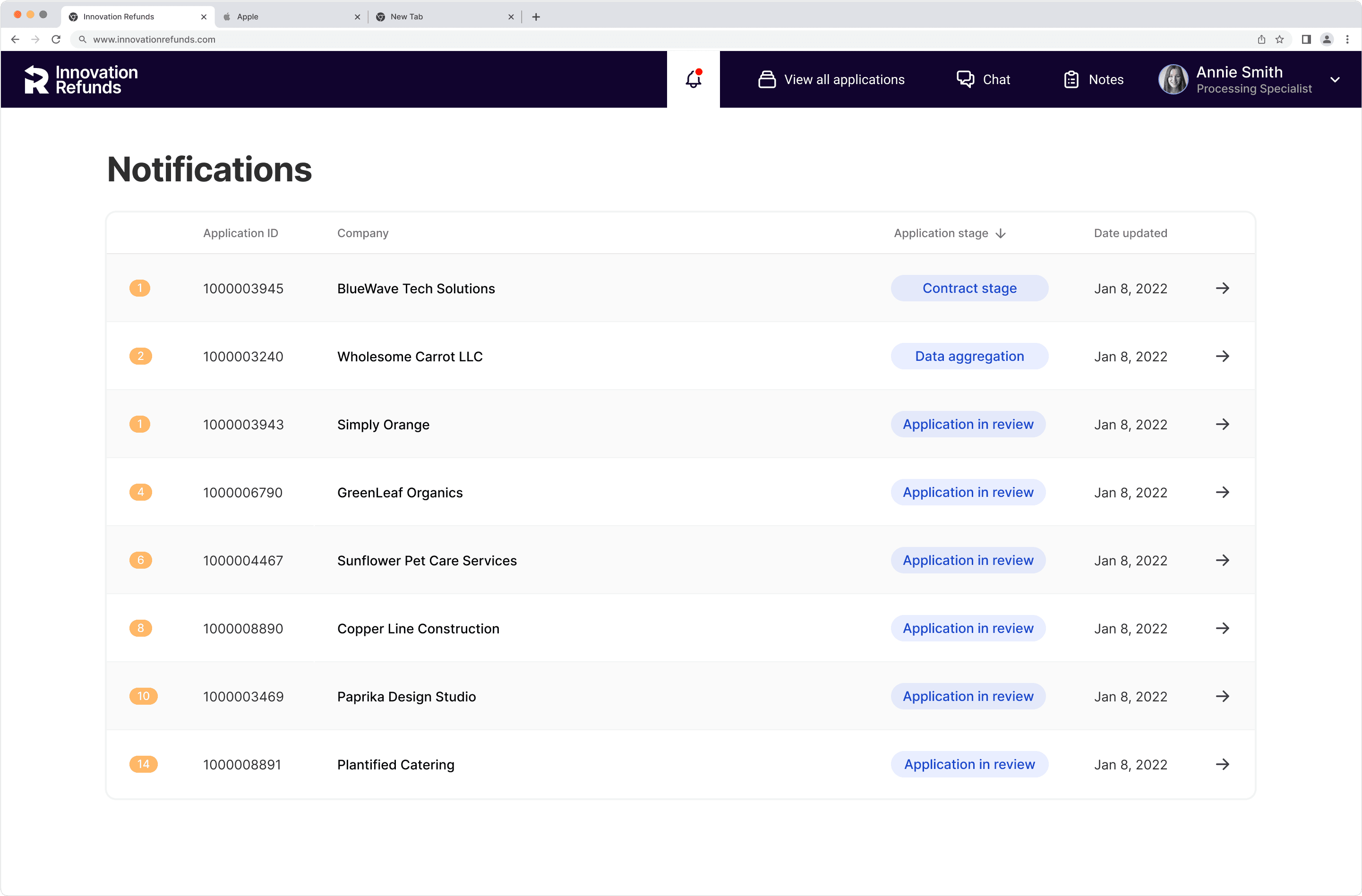
The case dashboard view focused only on documents needing review, making navigating the case more difficult when a different task was required of them.
The original applications screen & case dashboard can be seen below:
-> I drove sessions with product, engineering, and operations to map out all of the different types of information the processing specialist needed to be made aware of through the entirety of the case lifecycle - some required their action, and some were just information they needed to be made aware of.
-> I identified the difference in type and priority, action items being more important than case status, or informational alerts.

Drawing out all user flows
-> I worked closely with the PM and operations team to make sure we mapped out what all the user flows for each of the actions the specialists would have to take throughout the lifecycle of the case were taken into consideration.
-> This ensured we could design a system without missing any important detail.

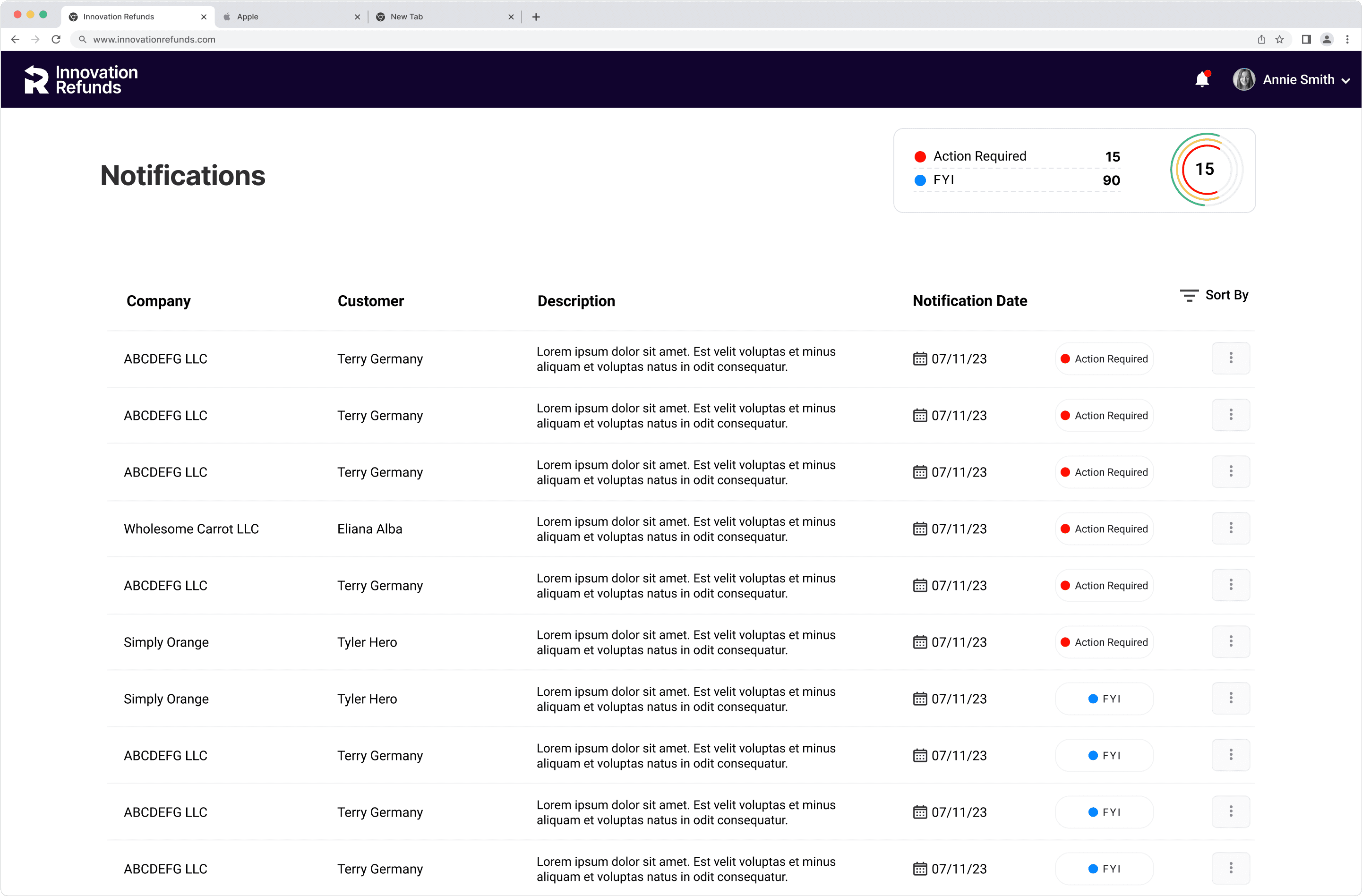
Notifications screen
-> Focus: How Might We highlight to processing specialists the new actions they needed to do for different cases, and help prioritize amongst them.
Early iteration
-> After looking at it I quickly realized this design would have the processing specialists jumping around from case to case too much, making it very difficult to pay attention to the overall life cycle of each case.
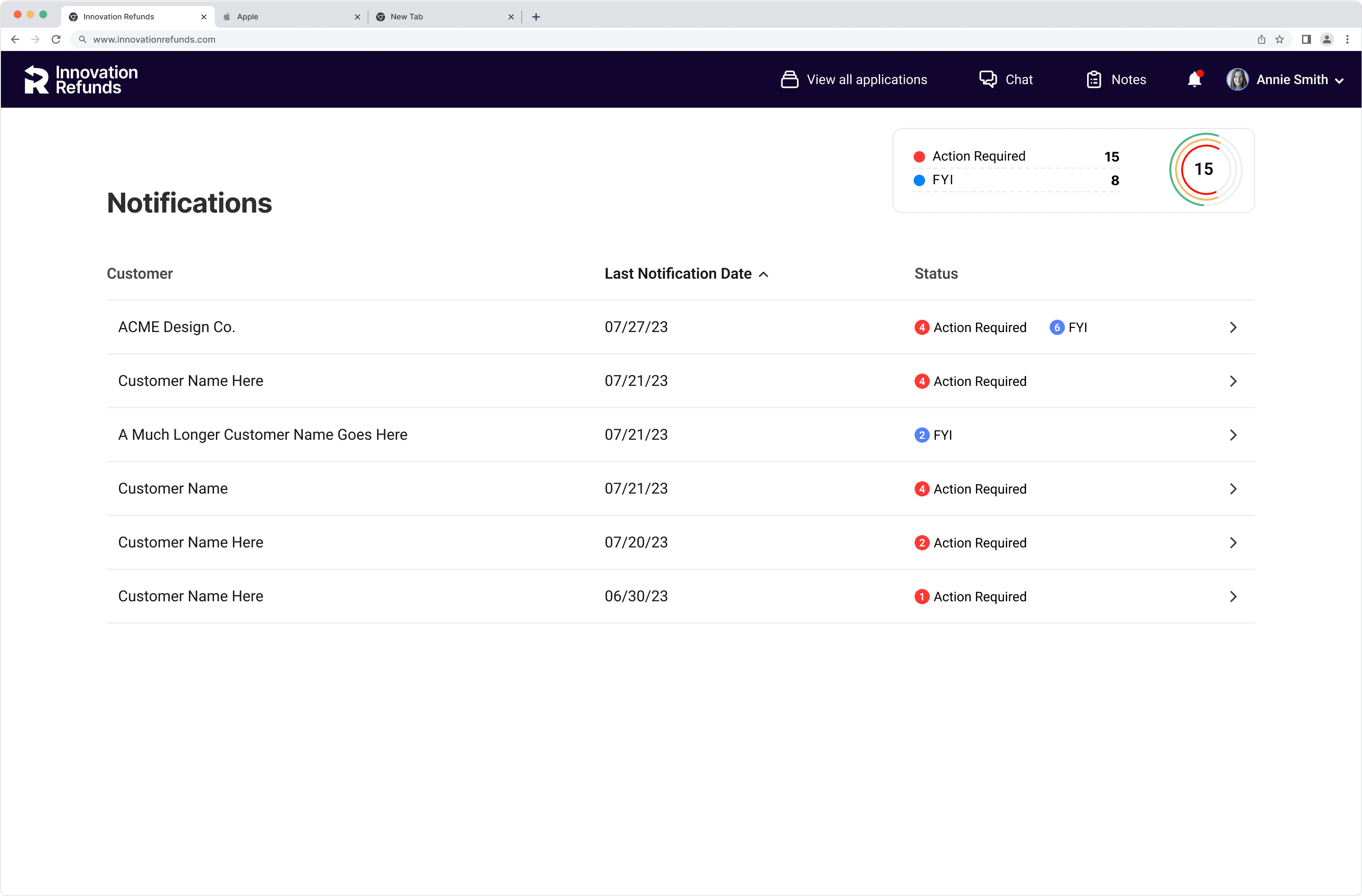


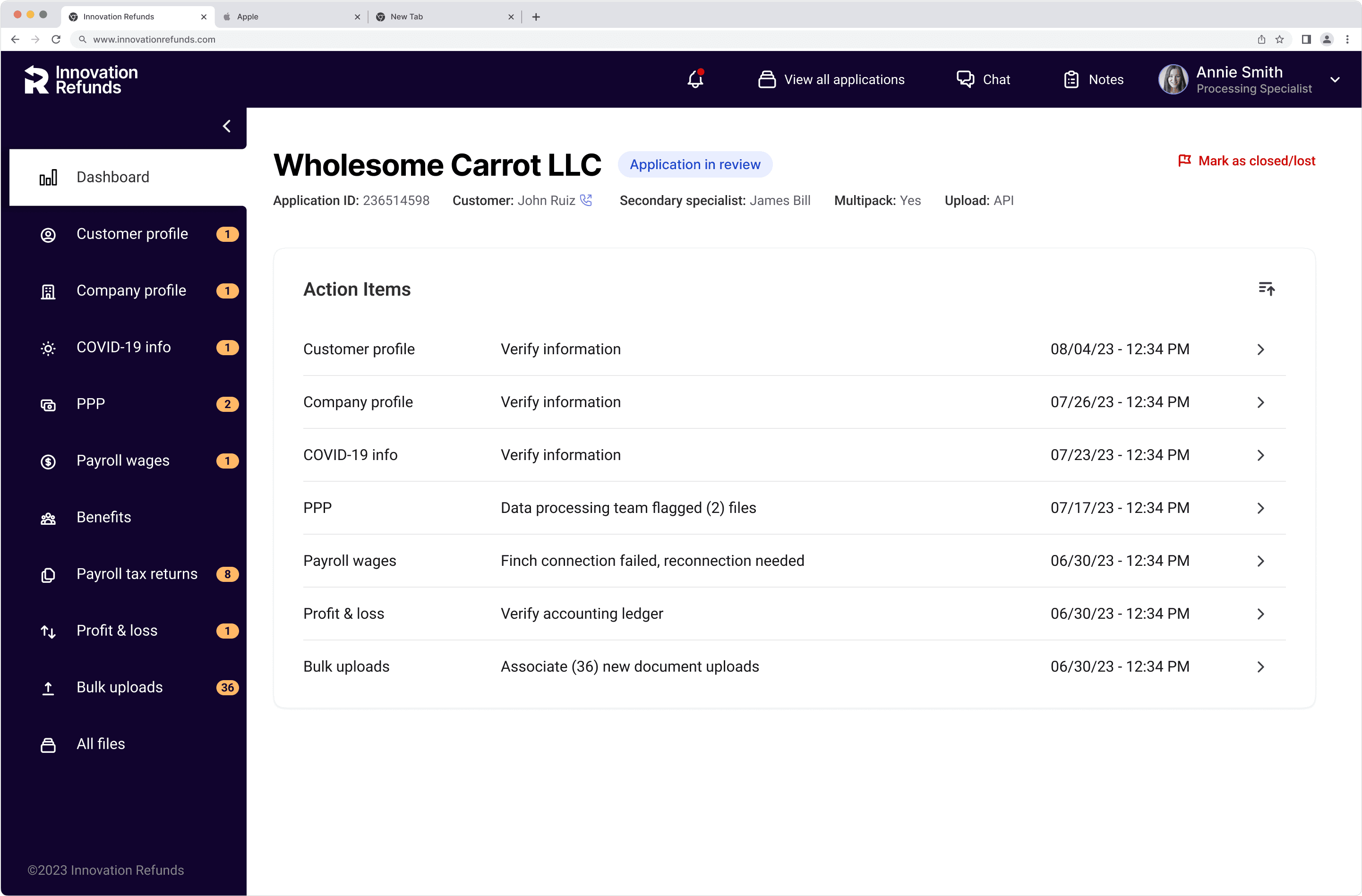
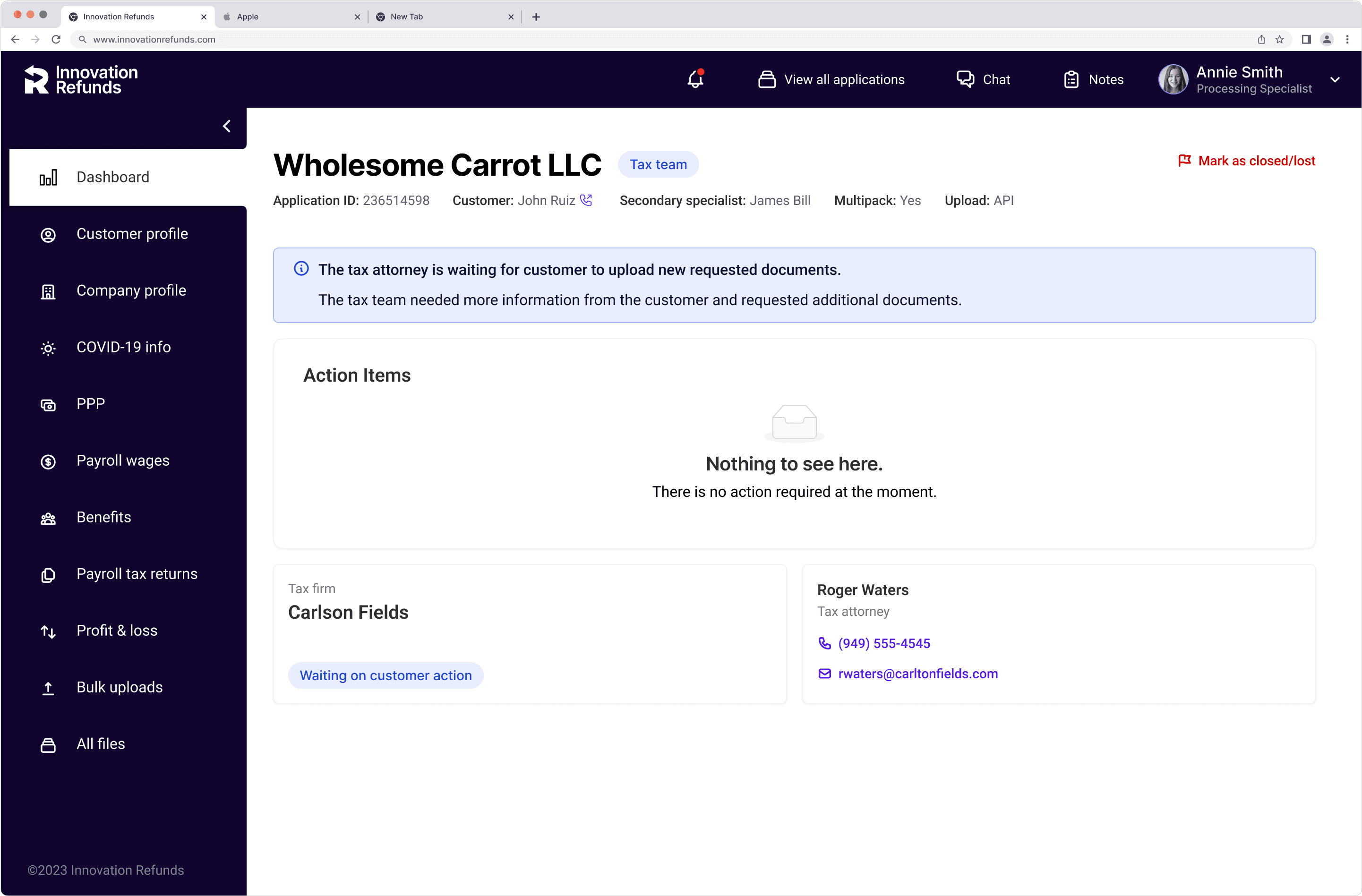
In-case actions + new dashboard
-> Focus: How Might We increase focus, efficiency & clarity within the case UI to ensure accurate and prompt completion of case actions needed to move case forward?
New dashboard
-> Task focused. Clear, clickable checklist of what needs to get done to move case forward.
-> Built with redundancy. Sidebar also signals where action items are as to not require them to go back to the dashboard to know where they have to go next if they have more than one.
-> Prioritized to push cases closer to finish. The cases that are in the stages closest to closing the deal and signing the contract get prioritized
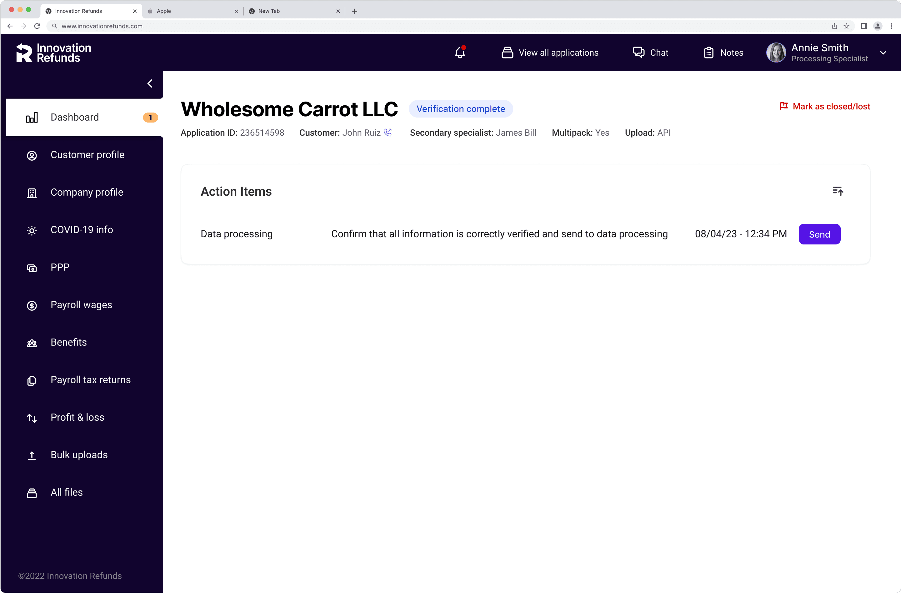
Actionable features directly from the dashboard
-> The new component allowed for new patterns such as completing tasks straight from the checklist.
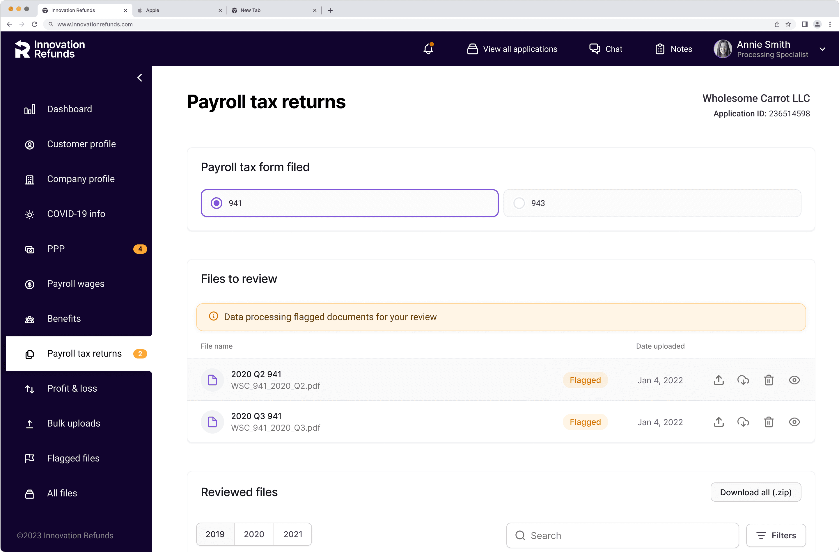
In-context guidance across the case pages
-> We kept the little alert dot pattern within the different sections as well to highlight where attention was needed.
-> The goal was to train the users almost like a game, to get all the yellow alerts out.
No yellow alerts = signal that no more needs doing within the case
-> It leaves it clear when it’s ok to move back to the notifications or all applications list to continue working through cases.
-> I used the blue as an informational color that indicated no action was needed.
-> Other components like the blue status bar, and the informational cards evolved throughout the case, and is why the dashboard was designed in such a modular manner.

Operations team immediately started seeing an increase in efficiency as we had been able to standardize a priority operations problem successfully.
Results
-> Our digital transformation of their tools and process led to a quintupling of operations efficiency based on conversions defined over a discrete period of time.
-> Change management - because we worked so closely with the operations team we were able to contribute to a more open adoption of a system they feared was there to replace them.
Challenges
-> Each design change could affect other portals - making sure we knew what everything triggered, and how each decisions rippled through, was vital.
-> Business stakeholders didn’t know the process themselves, so a big part of the job was helping them put their thoughts together and come up with a process that made sense and document it.
-> Leadership wanted everything ASAP (obviously right?), but there was a lot of back and forth involved so there was a lot of communicating that out.