web responsive + mobile app | Design lead
Fintech B2B marketplace democratizing tax incentives for SMBs - customer side
ROLE
Lead Product Designer
Team
2 UX designers,
1 interaction designer,
1 content designer
Tools
Figma, Notion, Loom, Jira, Amplitude

Innovation Refunds’ main mission was to democratize the Federal Grant and Incentive space traditionally dominated by large enterprise companies and provide access to the average SMB.
Problem
The process of submitting an incentive claim was convoluted, provided confusing directions and little transparency to customers, resulting in very long conversion cycles.
Response
Streamlined form experience with a quick tappable format and partner integrations that allowed them to upload documents in a couple of clicks, and a centralized dashboard with account management, task management, and progress tracking capabilities.

Understand
Research to deepen understanding of user needs. Map the systems, players & workflows, and align with stakeholders about problem definition.

Conceptualize
Early explorations that get shared quickly to establish direction: sketches, user flows, and information architecture. These evolve into higher fidelity workflows.

Evaluate
Share & measure - repeatedly. Through usability tests, and ensuring measurement plans are in place once the feature ships. Also, ensuring all stakeholders are trained on it.

Gathered research through interviews, surveys, and information that had been previously collected by the operations team to understand user pain points.
Trust
A lot of financial information is shared. Our experience needed to inspire trust, and also explain how we'd be using their data.
Transparency
Customers complained about not knowing the status of their case, which diminished trust in the company.
Time
Our customers were business owners with limited time and short attention spans. Tasks needed to be straight forward.

As a systems thinker, I made sure we drew out the full system, and how the different users would interact with each other and with our interface and backend. This way we were able to:
Ensure we were designing a customer experience that would connect seamlessly with other sides of the marketplace.
Identify gaps in the process we needed to work on with stakeholders.
Early iteration

-> Action items are prioritized front and center since task management is the most important feature to move cases forward,
-> Initially, I designed for the system to serve individual notifications for each task. However, I then realized that this caused the user to do a lot of back and forth between the home page, and the pages where the task needed to take place to complete their tasks.
Refined design

-> Location remains front & center
-> Decision to compress notifications into one summarized one that would lead to an action page instead of back and forth to different pages.
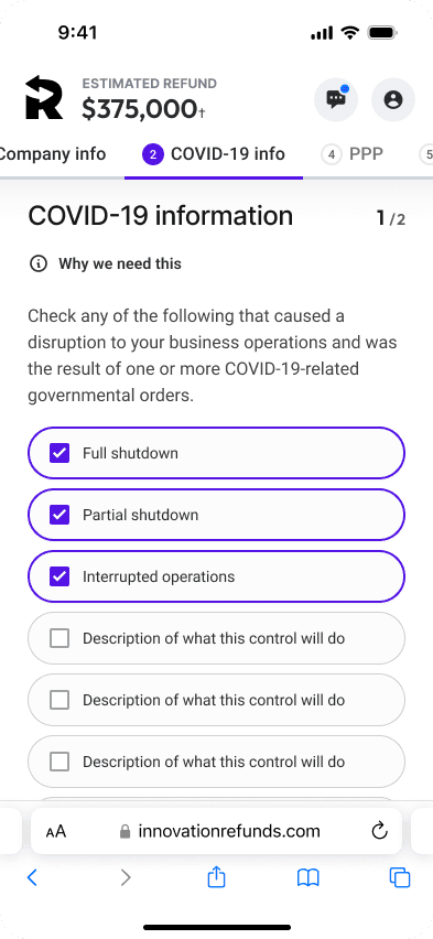
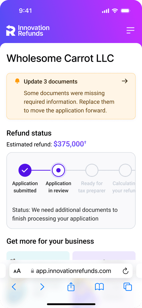
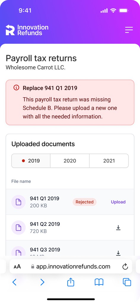
Status transparency with case tracker
-> Give a sense of where the case is & what to expect.
-> Details of status within the stage.
-> Several stages were left out after discussing with product and deciding what level of detail we wanted to provide users about the process.
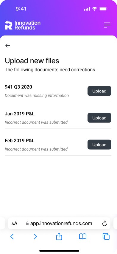
Focused action page
-> Rather than navigating to the different sections, and risk dropping off - a single page to complete task items.
-> If users went to specific sections, they would still be alerted of to-do and be able to complete it there, ensuring strategic redundancy.
Interaction with other portals


-> Since our design required content from the processing specialist as to what needed changing in the uploaded documents, the design in the Processing Specialist portal doing the review needed to be able to feed that content.
-> I originally designed it as an open text box as a first iteration, but we quickly learned that it resulted in confusing instructions so I worked with the operations team to standardize a form that would trigger specific responses.

Trust
Providing the option to dig deeper on how we use their information.
Transparency
Of progress and process through clear, numbered sections.
Time
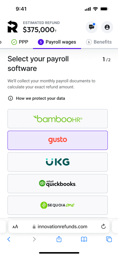
Quick options, like connecting payroll rather than uploading.
Progress tracking iterations
Early iteration

Refined design

-> Feedback indicated that while the first stepper provided clear indication of each section, it wasn't very telling how long each section would take you. And in mobile, they couldn't see all of them so they had to guesstimate how many sections there were.
-> By decoupling the progression within each section from the stepper, we were able to add more clarity, and as a result also be able to add the estimated refund at the top which was a proven incentive for applicants to continue.
Building trust iterations
Early iteration


Refined design

-> We knew customers were nervous about sharing financial company information. We ideated on how to resolve this and landed on telling them upfront through the voice of someone they already knew - their assigned support specialist.
-> We learned most customers were not reading it, and it was mostly noise occupying space.
-> We designed an opt-in to information option that popped out an informational modal that tested a lot better.
Improving form conversions
Early iteration

Refined design

Reducing optionality ≠ bigger drop-offs
We implemented integrations that allowed automatic connections of payroll & accounting data. Originally I designed it so that those who used software not available through our integration could opt to upload manually.
—> Talks with engineering led me to understand we needed to gather the software they used regardless to build for it in the future.
—> We suspected people were opting out of connecting their software out of mistrust, despite having a software that matched our system.
—> The original hypothesis was that forcing users to connect their payroll & accounting software would lead to more drop-offs, but having more users opt for manual proved to be worse for conversion that removing that optionality unless they really did not have a matching software.
After discussing with operations, engineering + product, we implemented the connection path as default, with users able to opt out only if they provided software not in our system, and saw an increase in conversions.
20,000 new customers were onboarded through this new customer experience within 90 days of launch. A record amount facilitated by an end-to-end express, digital experience with minimized confusion about how to start and follow along their case.
Challenges & learnings
-> Business stakeholders didn’t know the process themselves, so a big part of the job was helping them put their thoughts together and come up with a process that made sense and document it.
-> Each design change could affect other portals - making sure we knew what everything triggered, and how each decisions rippled through, was vital.